
iPhone X To 2G, Evolution Of Screen Size & Resolution [Infographic]
Apple’s heavily rumored iPhone X (pronounced “iPhone Ten”) was finally unveiled yesterday at one of the year’s most anticipated events and instantly became a matter of controversy given the bold liberties the Cupertino giant has taken with the design. The design of the front panel, in particular, came under heavy fire, with many a user and developer lamenting the company’s decision to wrap the nearly bezel-less display around a notch at the top that houses the amazing new TrueDepth module.
While the latter’s impressive depth-sensing capabilities has most prospective buyers convinced, it is the now notorious cleft that most feel compromises the usual symmetry of Apple’s design. Additionally, new concerns have been posited regarding the brightness of the display itself, which seems to be lagging behind that offered by the competition, such as the Samsung Galaxy Note 8.
What isn’t being contested is the quality of the new Super Retina display compared to previous-gen iPhone models, with it offering the biggest panel (5.8 inches diagonally) and highest resolution (1125 x 2436 pixels) in the product line’s history. Just how big of a leap is that, though? One way to answer that question is to visually compare both size and resolution, and that is exactly what the following infographic attempts to do.
Click the image to view its high resolution version (or this link, if you are visiting from a mobile device). If you’re looking to share this infographic, please share a link to this post instead of directly linking to the image itself.
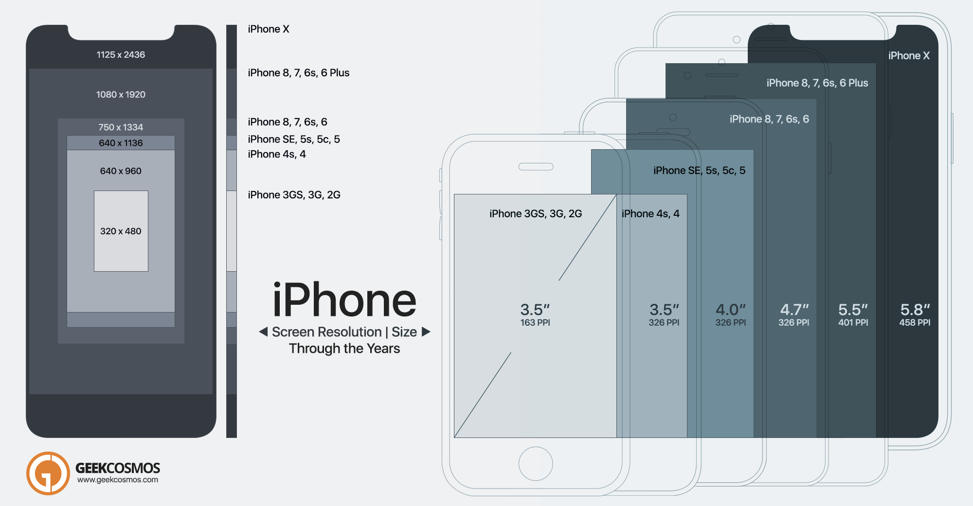
It is clear that the iPhone has come a long way since its debut in 2007. To improve upon the visual perspective that the infographic offers, the pixel count of the original iPhone, as this Twitter user notes, take up a bit more than two icons on the display of the iPhone X! Of course, resolution isn’t the only thing that’s important when it comes to displays. The story doesn’t end at size and display density either, with constant improvements in glare, brightness, and gamut being made to display technology through the years.
What’s your take on the evolution of the iPhone’s display? Do you like the direction it has taken? Sound off in the comment section below.
Liked this infographic? Check out our infographics section for similar posts.
Also, don’t forget to Like our Facebook page, Follow us on Twitter and/or add us to your Google+ Circles for instant social media updates from our website!


